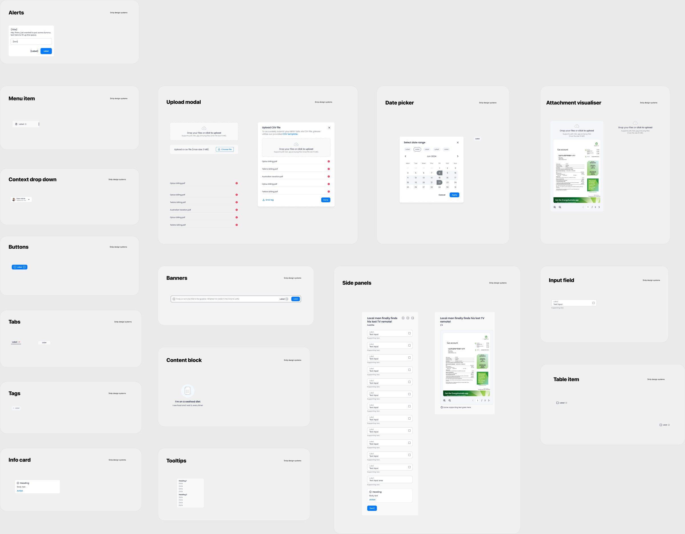
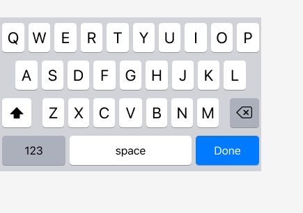
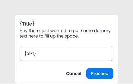
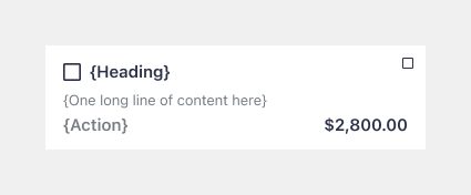
Sniip's design system was started by another designer. I built the Android and agent portal libraries, added components to iOS, and I keep adding to it with every new feature. Today it has 437 components and nearly 500 icons, illustrations and logos across three platforms.
- Company
- Sniip — bill payments, Australia
- Role
- Product Designer, contributor
- Team
- Started by another designer. I built the Android and agent portal libraries and added to iOS
- Timeline
- Ongoing, growing with every feature
- Platform
- iOS, Android & web
- Design system
- Colour & type tokens
- Component states
- Documentation
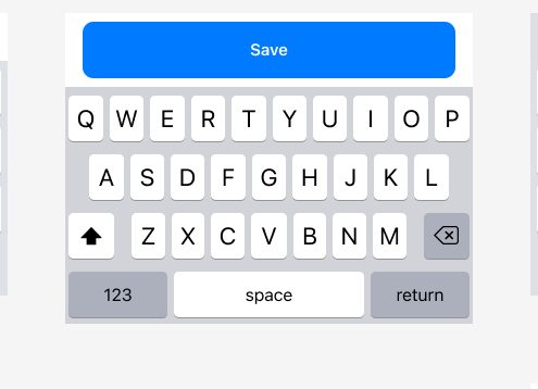
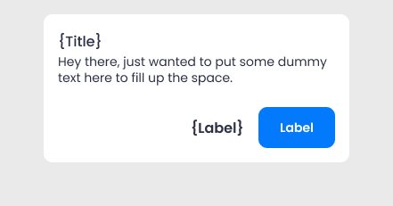

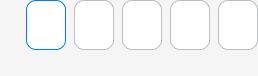

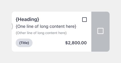
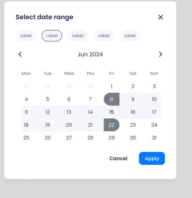

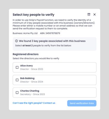
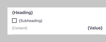


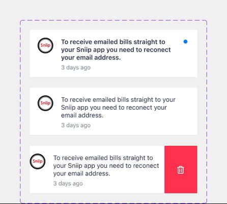
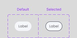
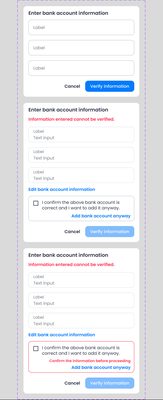
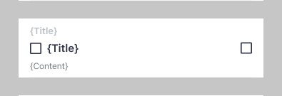



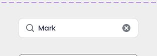
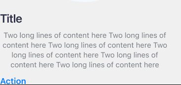
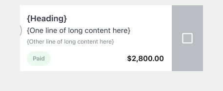
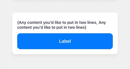
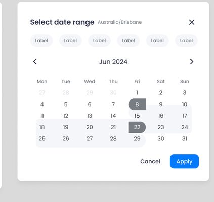
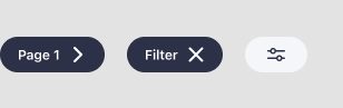
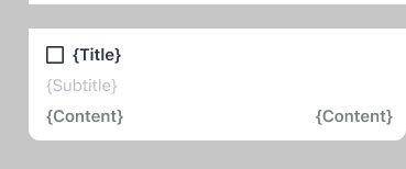

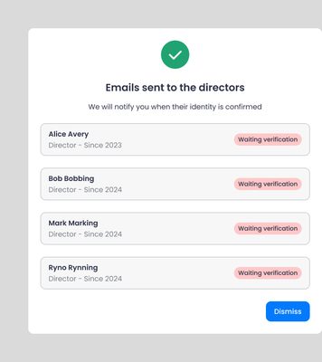
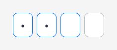
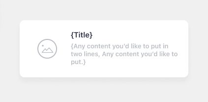
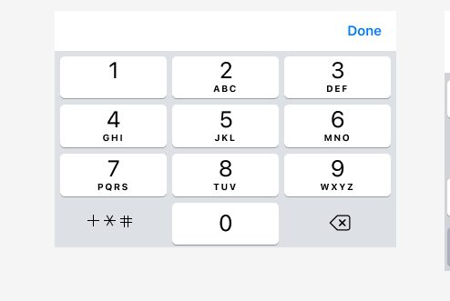
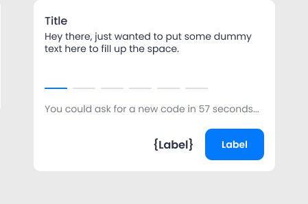
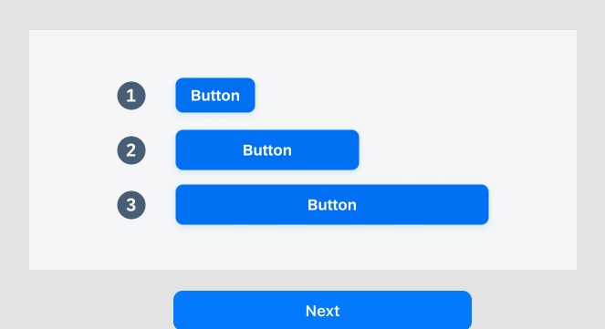
437
Components, across iOS, Android and the agent portal
477
Icons, illustrations, logos and card designs
92
Colour, text and effect styles
3
Platforms built from one foundation
Counted from the live libraries, archive pages left out. Every tile is a real component.
01 ProblemWithout a shared base, each component was designed three times and ended up different on each platform.
Sniip designs for three platforms: the iOS app, the Android app and the agent portal, which the libraries still call CWP. Each has its own conventions, and the portal needs tables, side panels and upload flows the app never does.
Before the system, the app was less uniform and less consistent, and pages took longer to design because nothing was saved to reuse.
02 ProcessShare the basics, and let each platform keep its own native feel.
01
One foundation, three libraries
One Styles library holds the colours, text styles and shadows, and one Assets library holds the icons, illustrations and logos. Each platform has its own component library on top of these two. If we change a colour, it changes everywhere, but each platform still feels native.
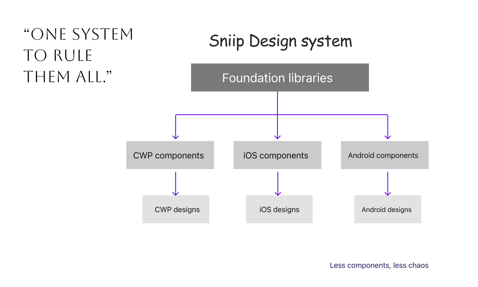
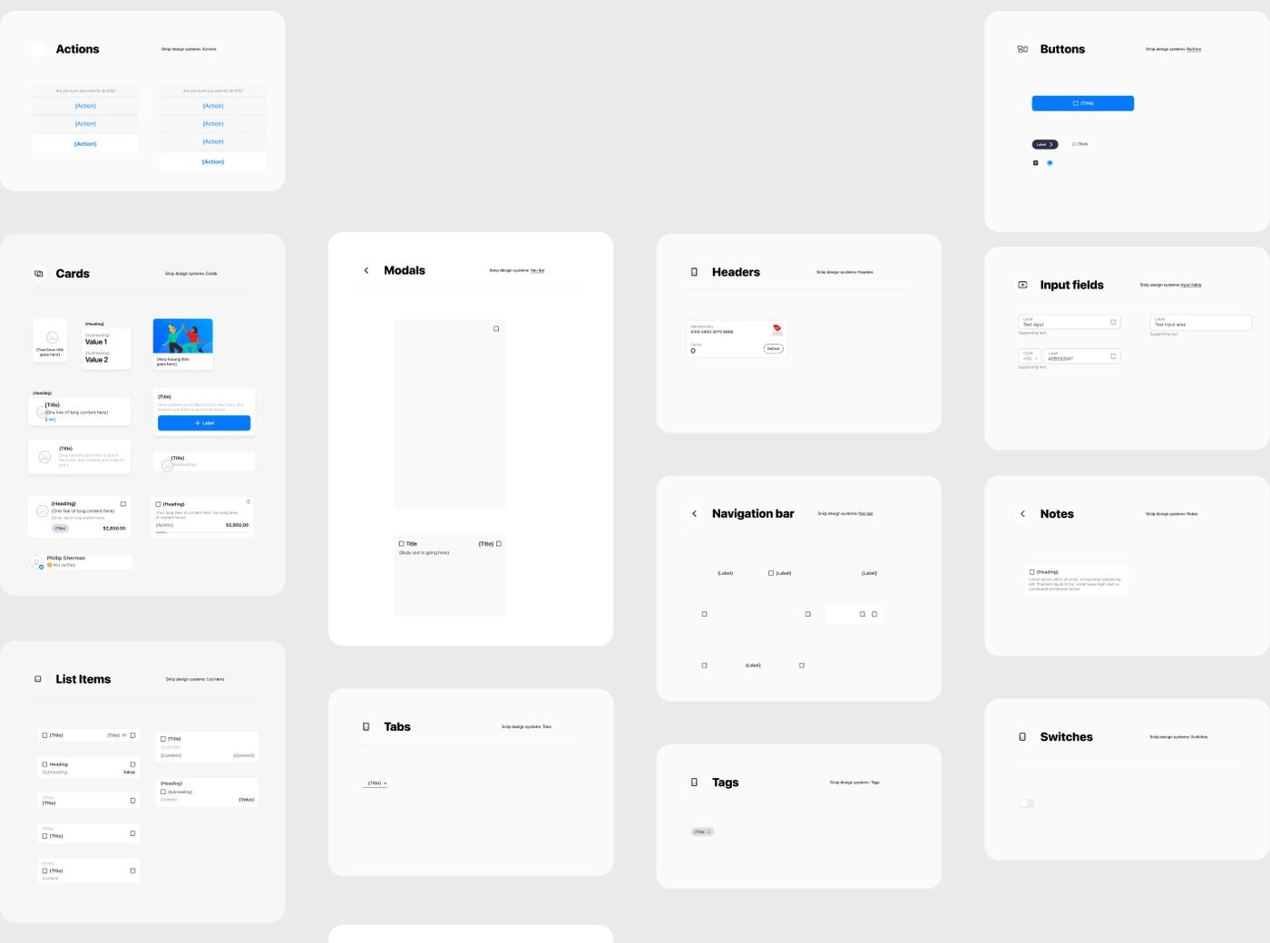
The first page of the components file: shared foundations, a library per platform 02
Build new components with variants
The system started with master components, and every version was a copy with overrides. When Figma introduced variants, we started building every new component with variants, so all its versions are in one place.
We didn’t migrate the old components, so the file has both. The rule is that anything built after variants uses variants.
03
Name colours by what they are used for
Together with the designer who started the system, I renamed the colours based on what they are used for, like ColorPrimary, ColorOnBG and ColorError, so a name means the same thing on every platform. We did the same with type: SF Pro on iOS and Poppins on the portal use the same scale and names.
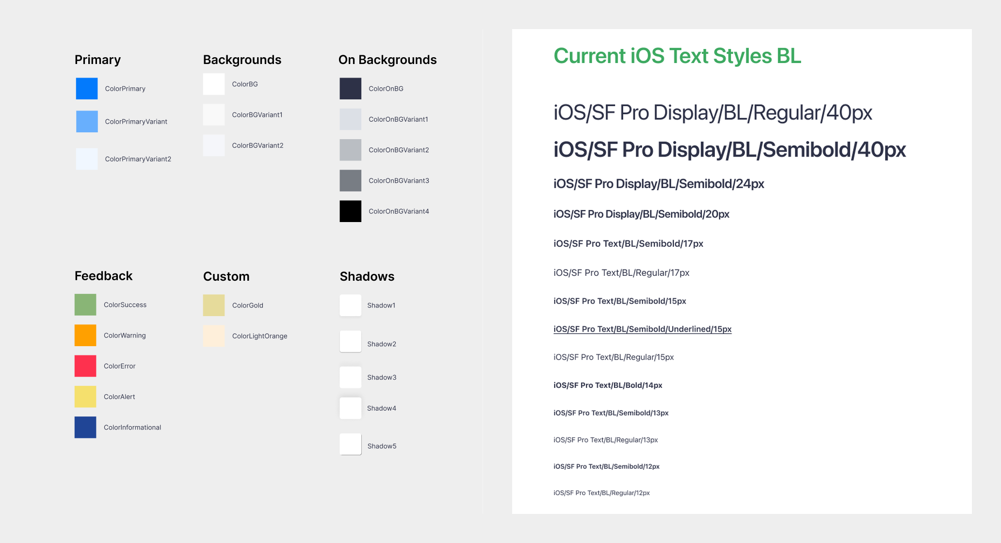
Colours named for their job, and the iOS type scale 04
Design every state of a component
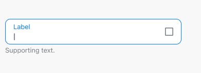
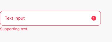
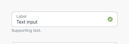
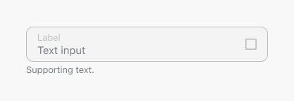
For me a component is finished only when all its states are designed. I designed the agent portal’s input field for every case a form can have, from disabled to error to read-only, both empty and filled. This way nobody has to guess what an error looks like on a read-only field.
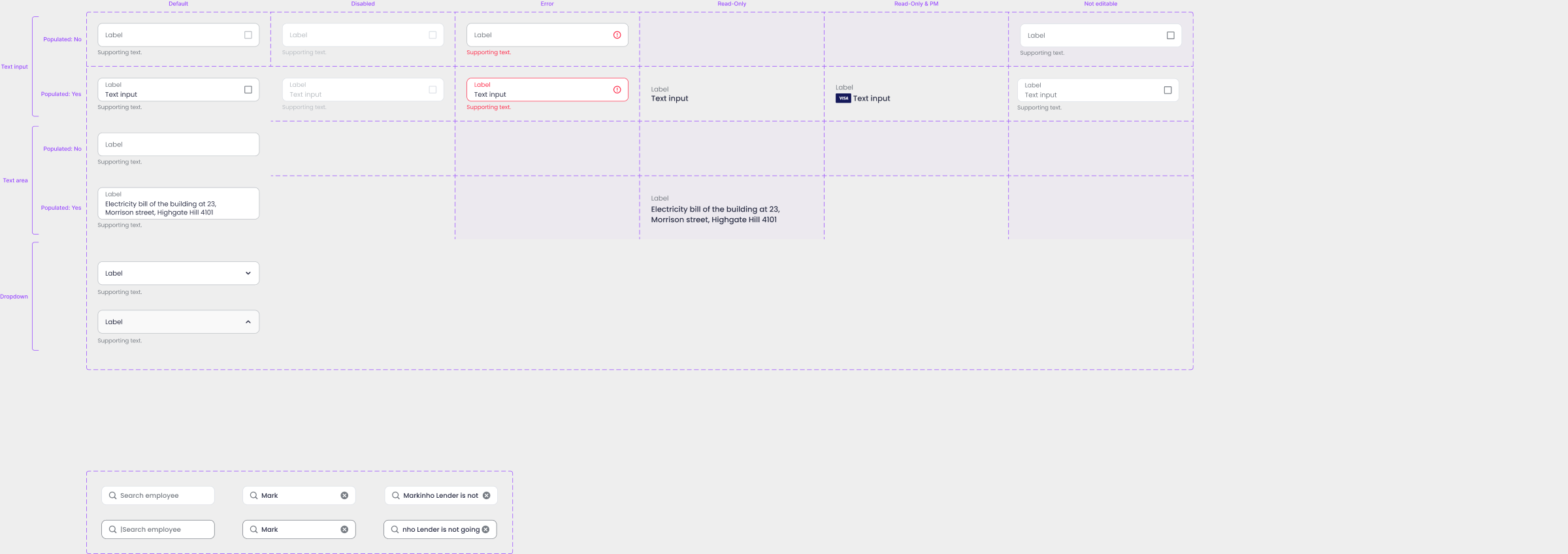
One input field, every state it can be in 05
Tables for the agent portal
The portal works with batches of bills, failed imports and payroll, so its library needed something the app never did: tables. Each table has a header and a matching row, so designing a new screen is mostly about picking the right pair.
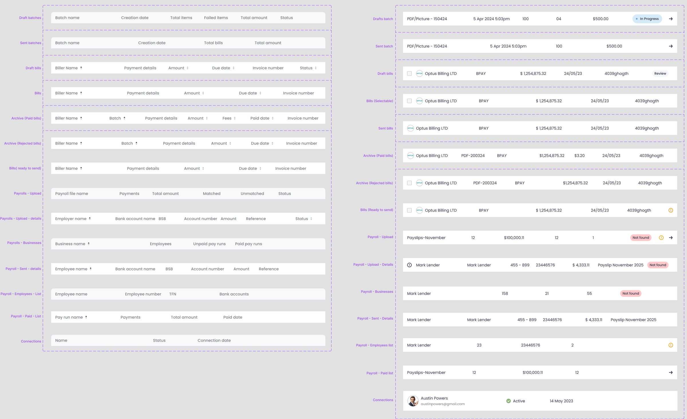
A header and a row for every table in the portal 06
Grow the system with the product
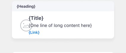
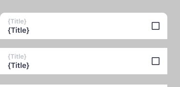
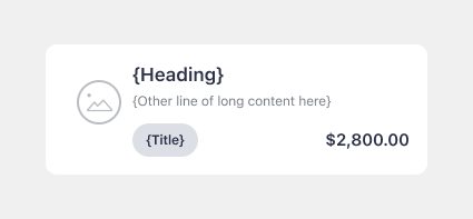
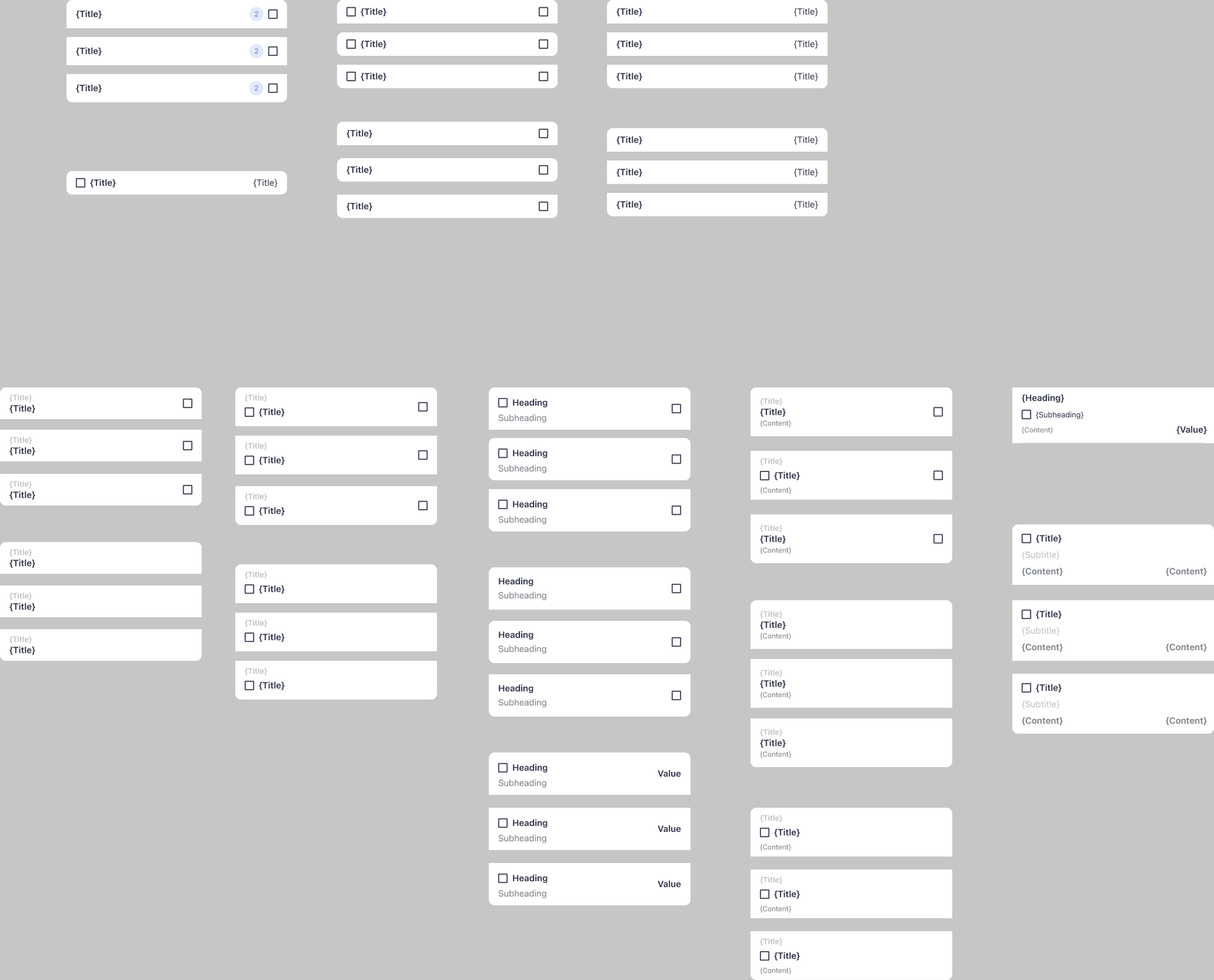
Components are added as features are built and sections are redesigned. The account redesign, for example, added the list rows and value cards that every section now shares.
07
Keep the small things in one place
The icons are in the Assets library, 212 of them in outline and filled pairs, together with 110 illustrations. We review the system regularly and archive the components nobody uses anymore, to keep it light.
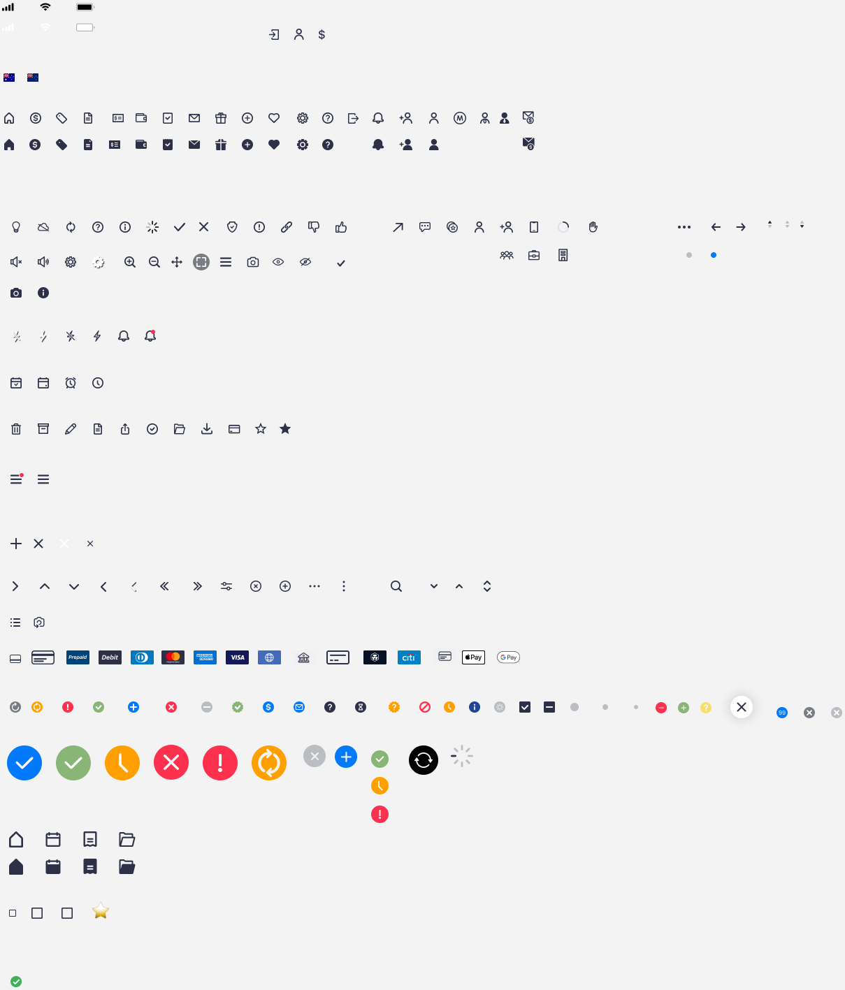
212 icons, most in outline and filled pairs
03 SolutionNow every screen, on every platform, is built from the same components.
Three platforms built on the same foundation. Every screen starts from components that already have all their states, with colours and type that mean the same thing everywhere.
04 Outcome
Designers work faster and the product is more consistent, because every platform uses the same components. Now that AI is part of the work, this matters even more: the system gives AI the components and rules it needs to get a design right.
Looking back
The naming convention. Some names can be confusing, and that is the part I would do better.
With the product and engineering teams at Sniip