When you import a bill, Sniip reads the details automatically, and those details decide where the money goes. People trusted them too much, skipped the review and sometimes paid the wrong biller. We redesigned the review so people actually check the bill before paying it.
- Company
- Sniip — bill payments, Australia
- Role
- Product Designer
- Team
- 2 designers, 1 product lead, 3 developers (2 front-end, 1 back-end)
- Timeline
- About 4–5 months
- Platform
- iOS & Android
- Interaction design
- Flow design
- Usability testing
- Design system
01 ProblemPeople had to check the details without seeing the bill, so they just ticked the boxes.
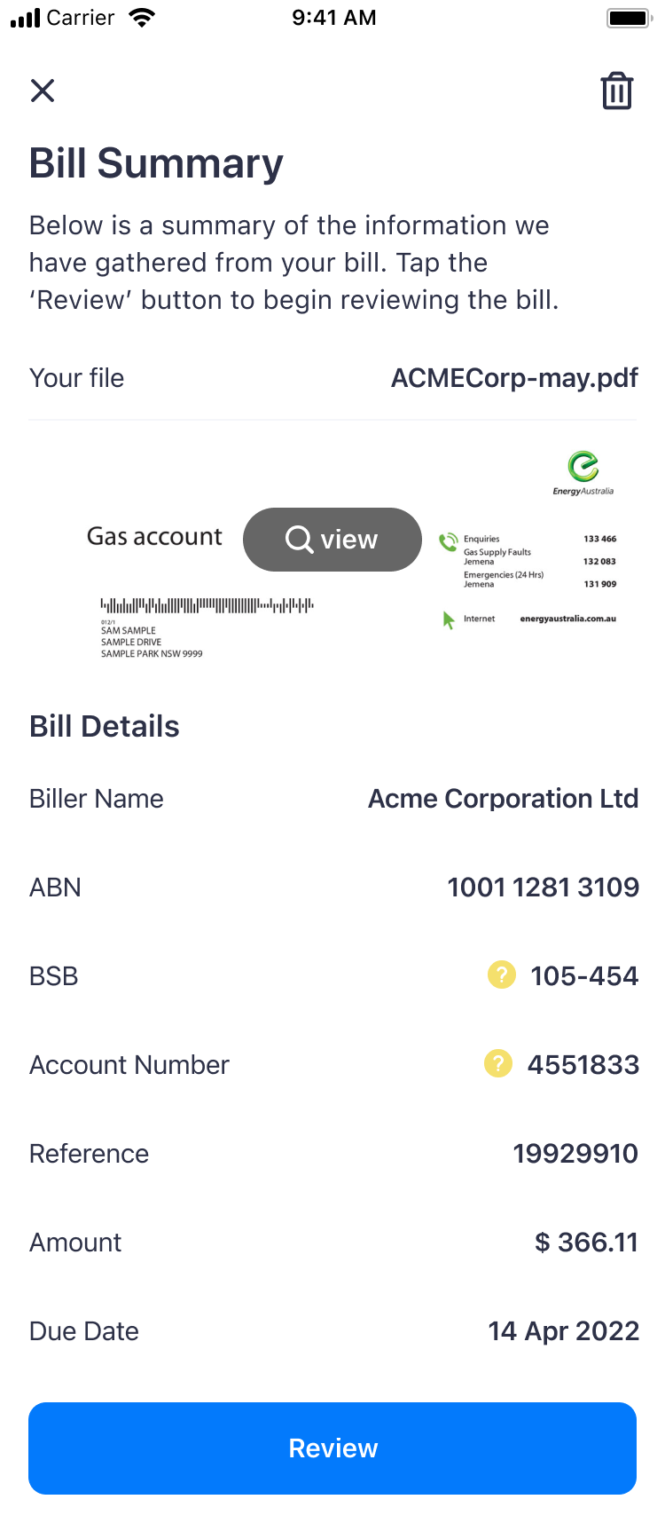
In the old review the bill was split over four screens, each one with a small cropped thumbnail and a checkbox next to every field. To check a number you had to open the bill full screen, remember it, close it and compare. There was only one warning for all the fields, and you closed it with "Got it!".
Most people just ticked the boxes, and some of them paid the wrong biller. A payment with the wrong BSB or account number goes to someone else, and it can’t be reversed.
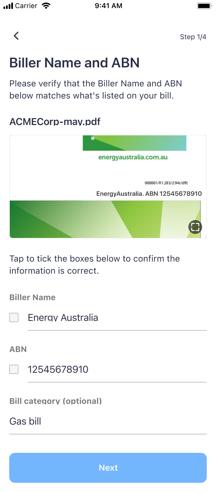
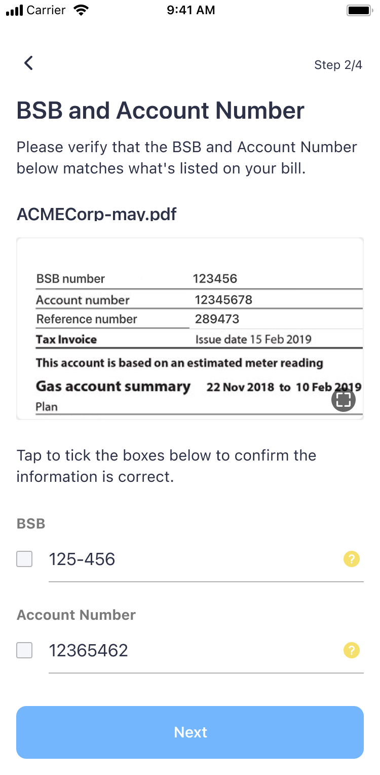
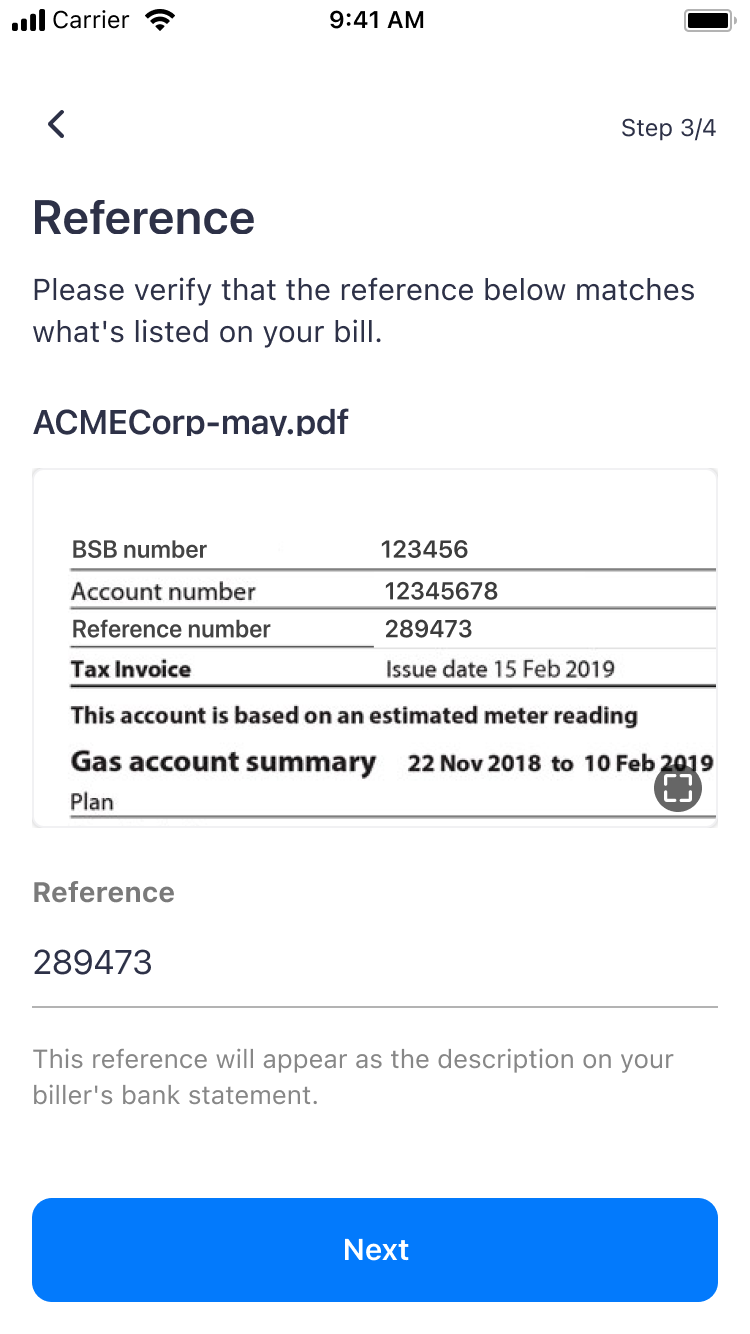
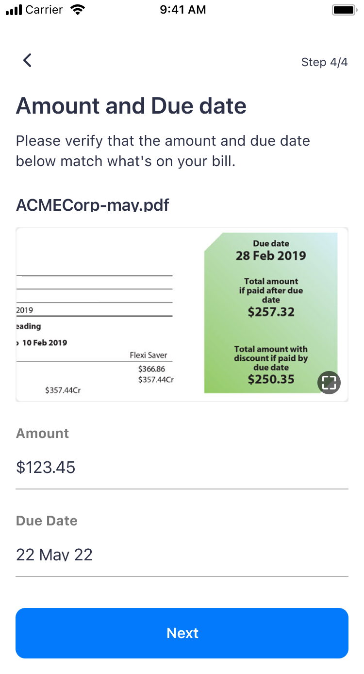
02 ProcessThree changes to make the review easier to do properly.
01
Put the bill and the field on the same screen
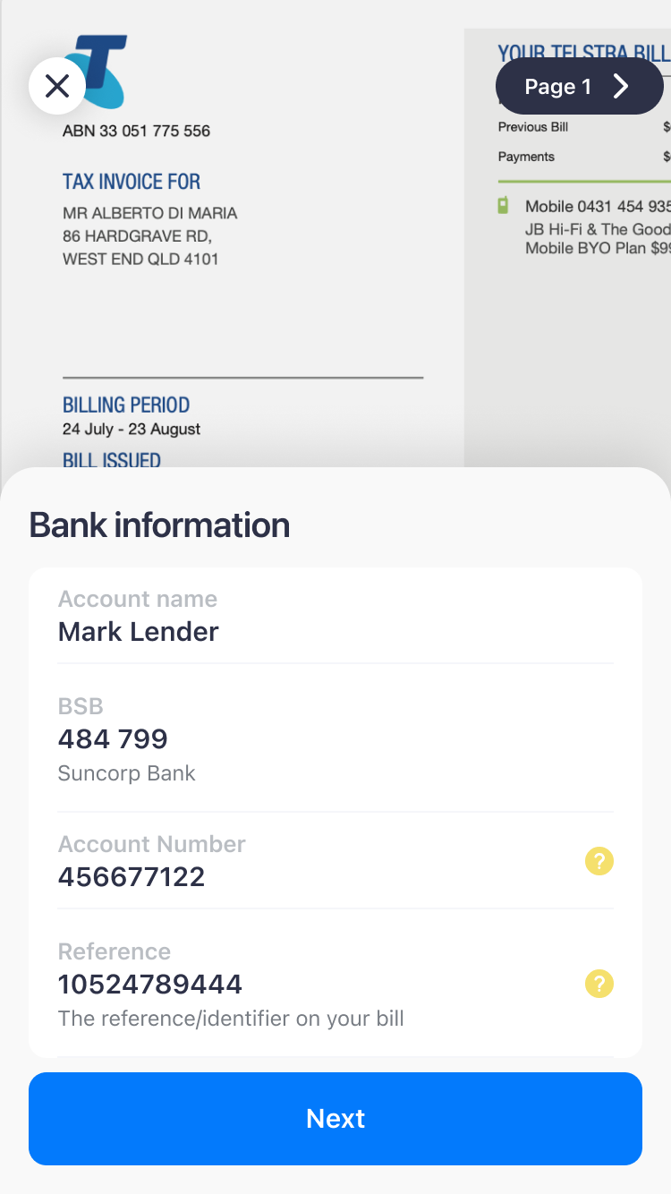
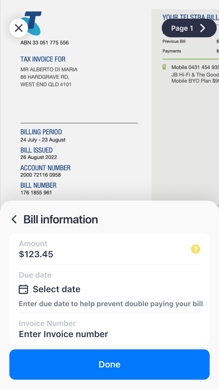
Reviewing a bill means comparing what the app read with what is written on the bill, but the old flow never showed the two together. We made the bill the background, full size and scrollable, and moved the review into a sheet on top of it. This way you see the number on the bill and in the field at the same time.
With the sheet there is less space for the form, so fewer fields fit on screen. In testing, that turned out to be what people preferred.
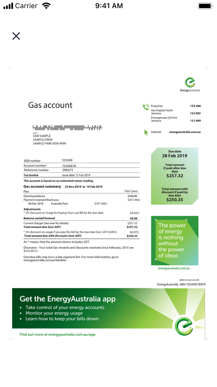
The old viewer showed the whole bill, but on a separate screen with nothing to compare it to 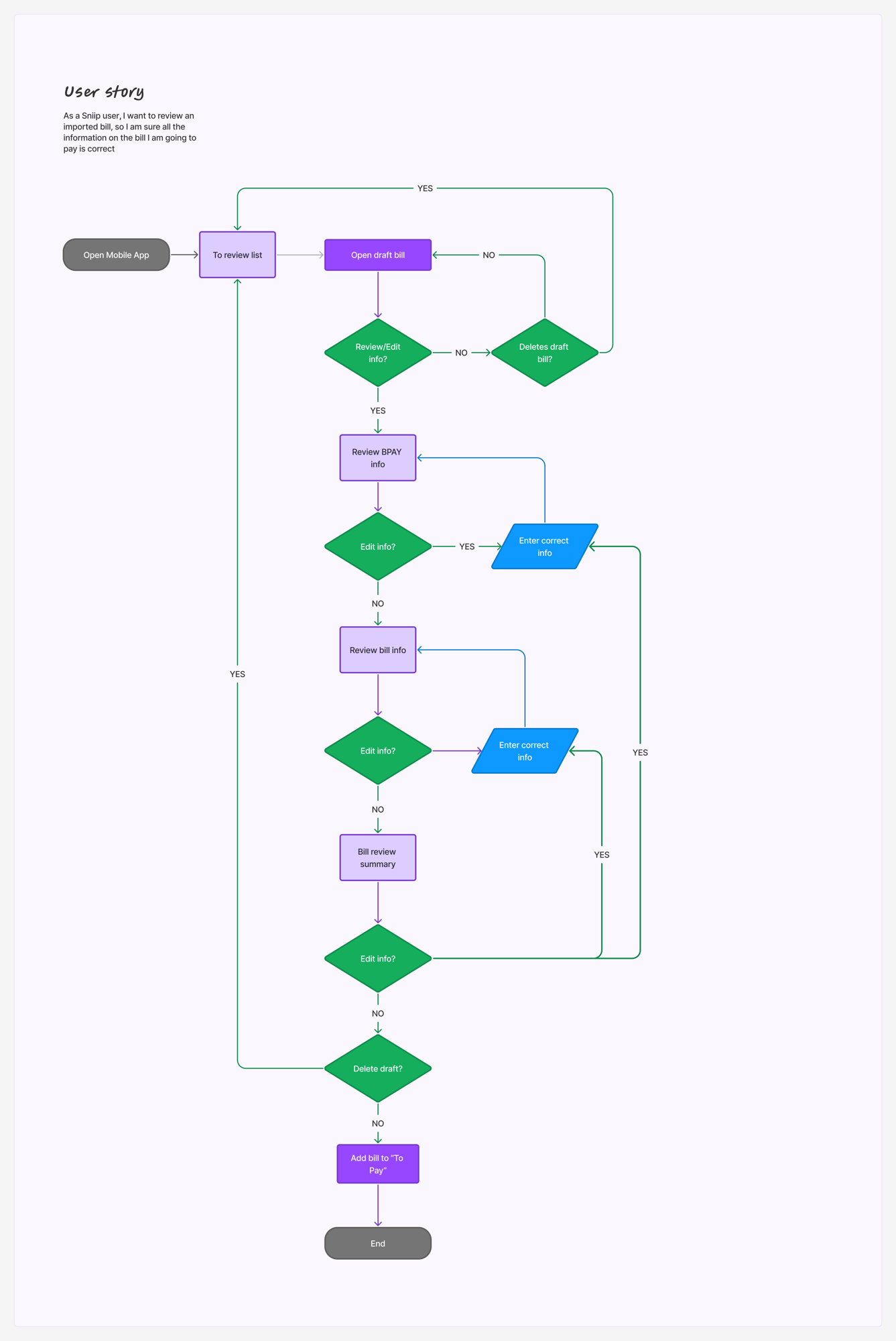
For each group of fields you review, edit if something is wrong and move on. You can leave the draft at any point 02
Group the fields the way the bill is laid out
In testing, people preferred to check fewer fields at a time, so we went from four steps to three shorter ones. The fields are grouped the way they usually appear on a paper bill: BSB and account number, then account name and reference, then amount and due date. This way you check one part of the bill at a time.
03
A warning for each field
This change made the review a bit slower, and that was the point. Each field now has its own warning that explains why it matters, for example "to make sure you are paying the right amount". If the app can’t read a field, it shows "Not found" and you can’t go to the next step. We also removed the checkboxes, so there is nothing to tick without looking.
At first the management team wasn’t happy about adding steps. They changed their mind once they saw how much easier it was to review a bill, and how many fewer mistakes people made.
Before
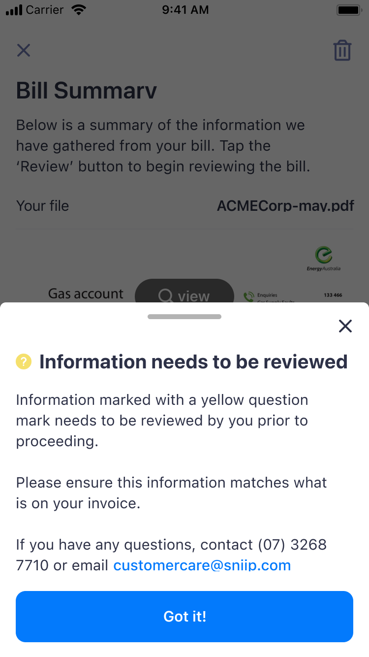
The same sentence for every field, dismissed with "Got it!" After
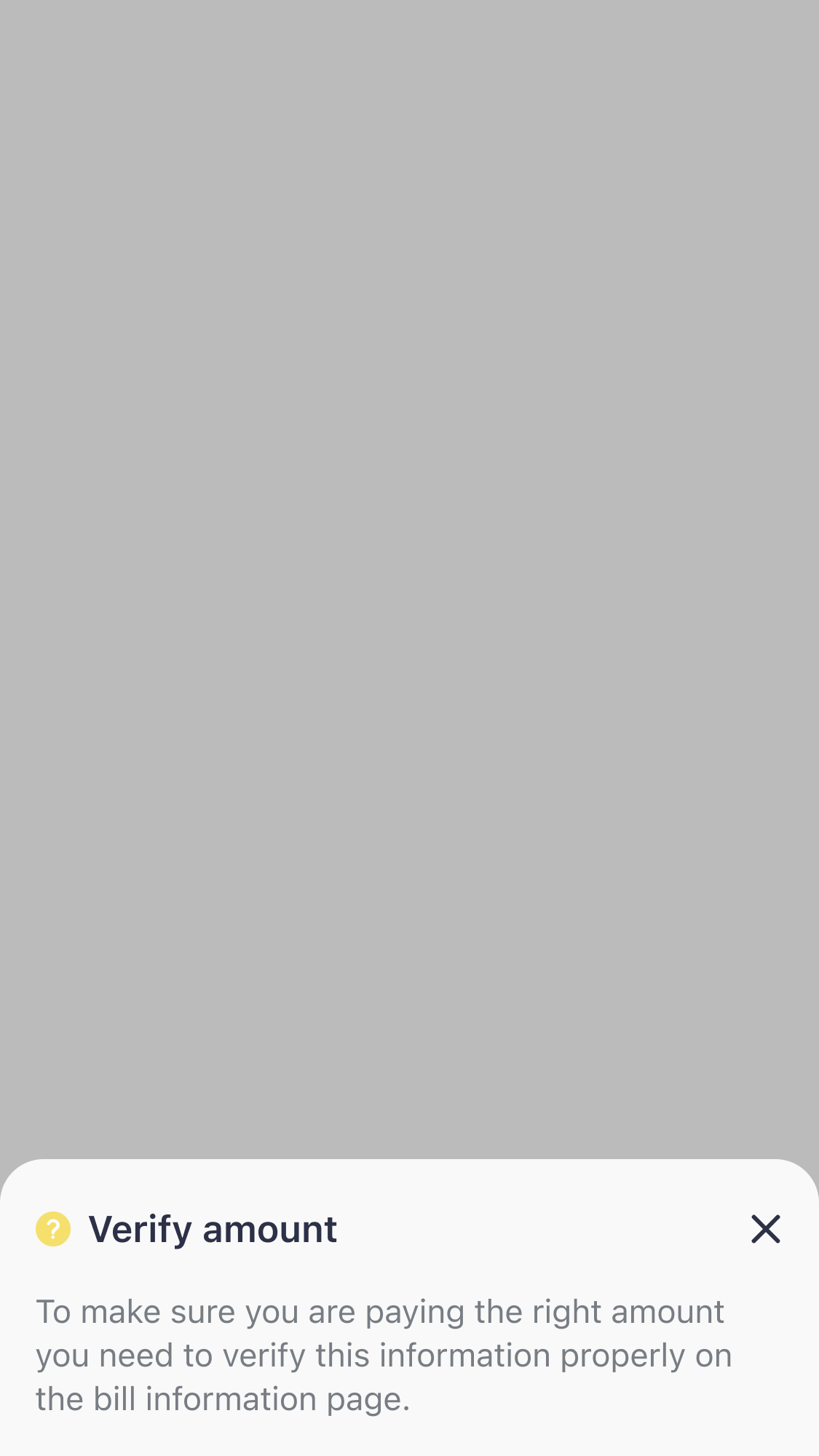
A message for each field, explaining what can go wrong 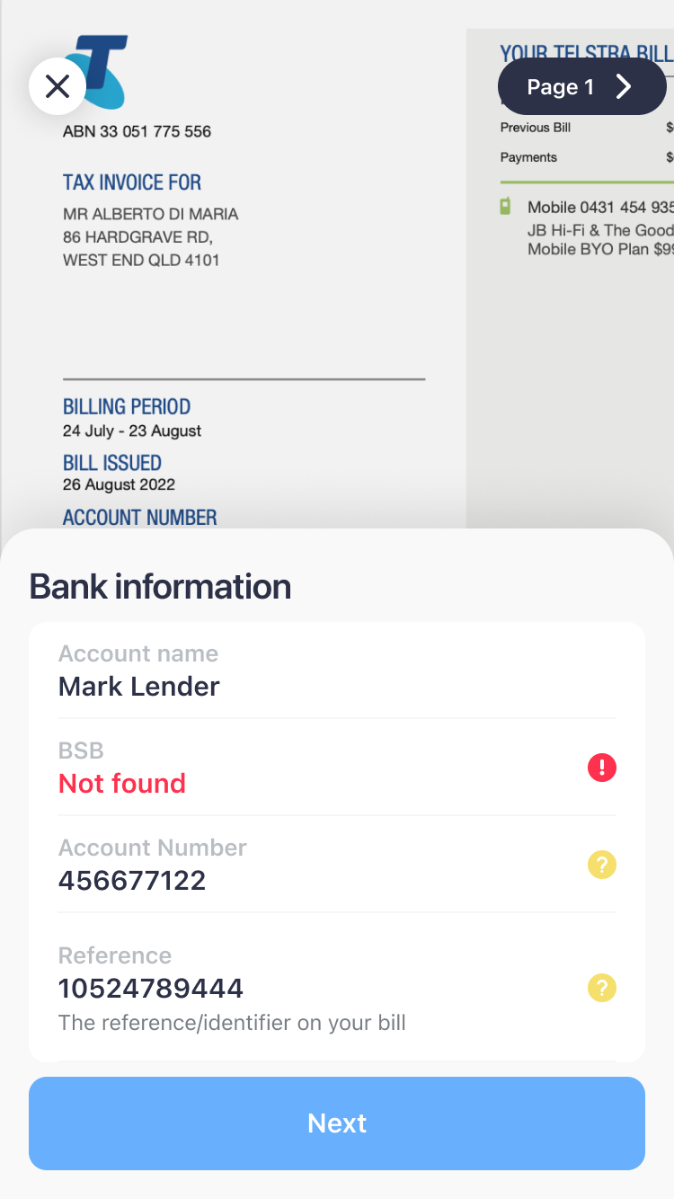
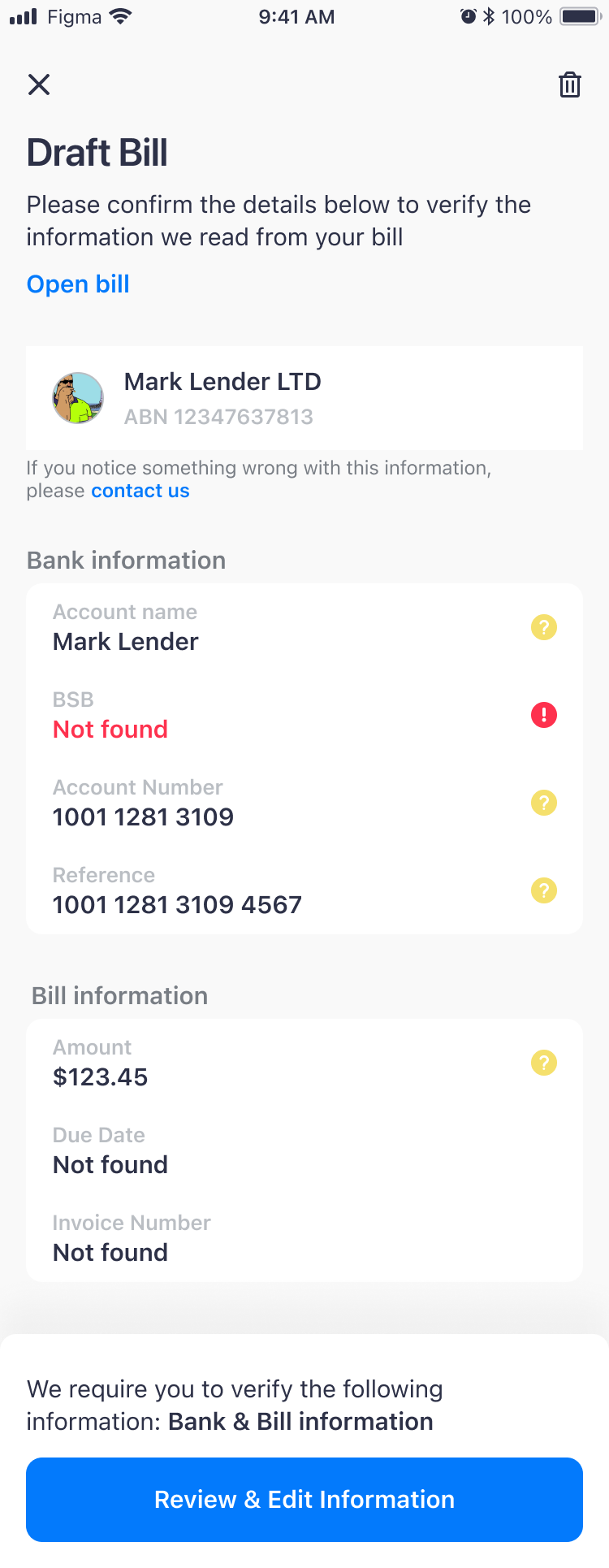
If a field can’t be read, Next stays disabled
03 SolutionThe bill stays on screen while you check it, in three short steps.
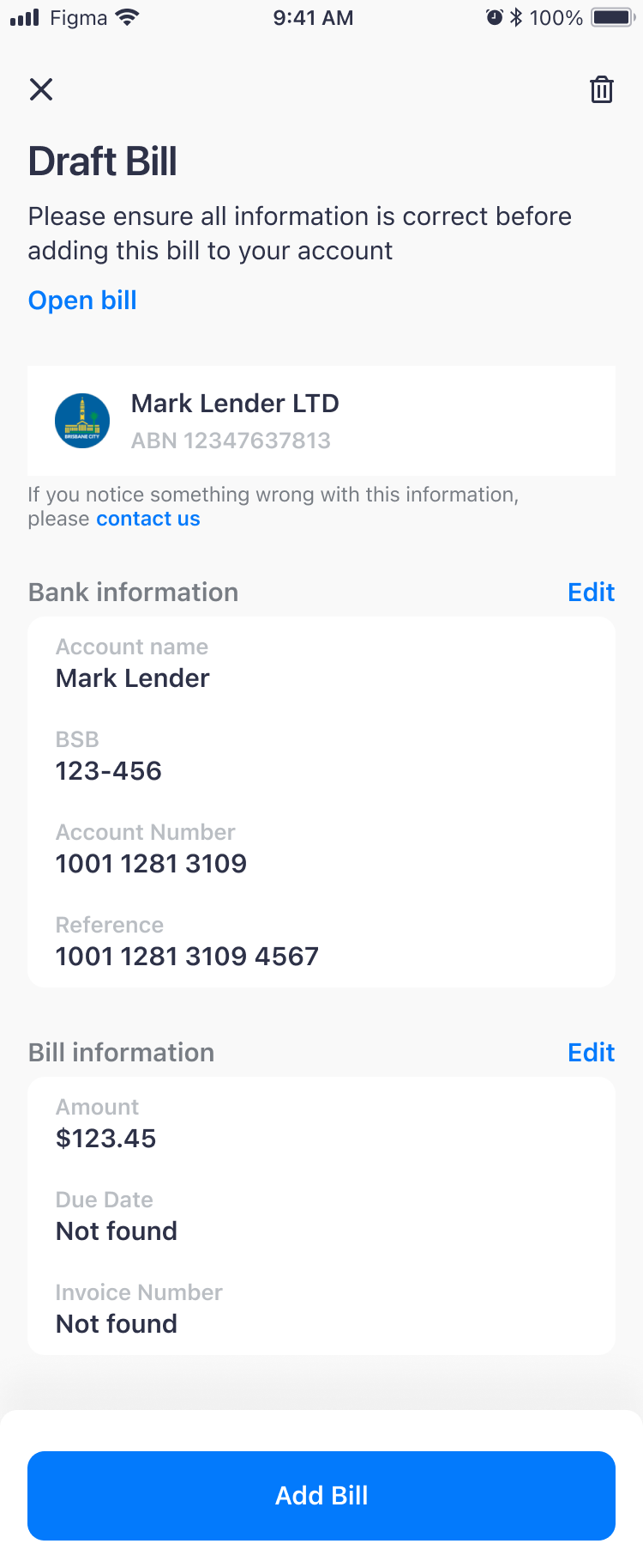
Now when you import a bill, the app creates a draft with everything it read. You check it against the real bill in three short steps, and only then is the bill added to your account.
04 OutcomeFewer payments to the wrong biller, and two of the three decisions came from testing.
After the release, a lot fewer people called customer support because they paid the wrong biller, which was the main reason for the redesign.
Two of the three decisions came from testing: checking fewer fields at a time, and removing the checkboxes after we saw people ticking them without reading.
Looking back
I would put fewer warnings on the draft page. The review steps already ask people to check each detail, so warning them beforehand says the same thing twice.
With another designer, the product lead and three developers at Sniip