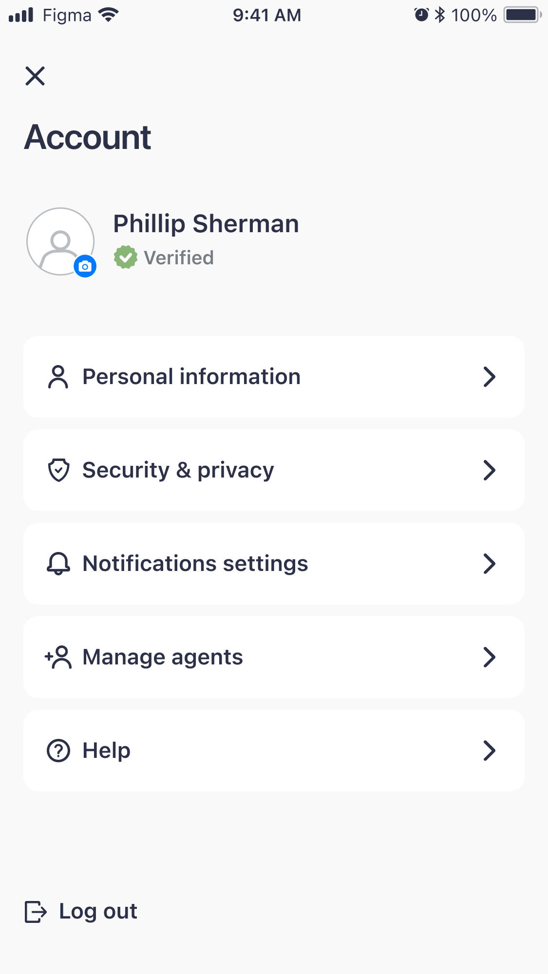
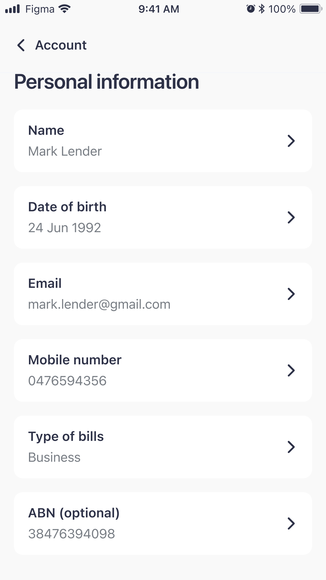
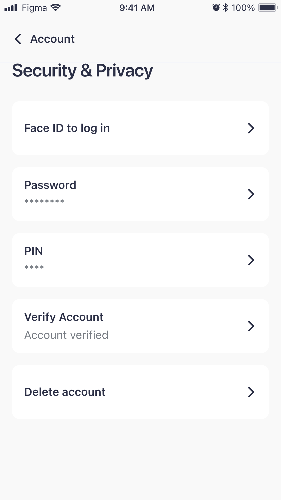
The account section used to be one crowded page, with a lot of information and no order to it. We split it into separate sections, so each page does one job.
- Company
- Sniip — bill payments, Australia
- Role
- Product Designer
- Team
- 2 designers, 1 product lead, 3 developers (2 front-end, 1 back-end)
- Timeline
- About 6 months, from business requirements to release
- Platform
- iOS & Android
- Information architecture
- Interaction design
- UI design
- Design system
01 ProblemEverything about your account was on one page, with no space to add anything new.
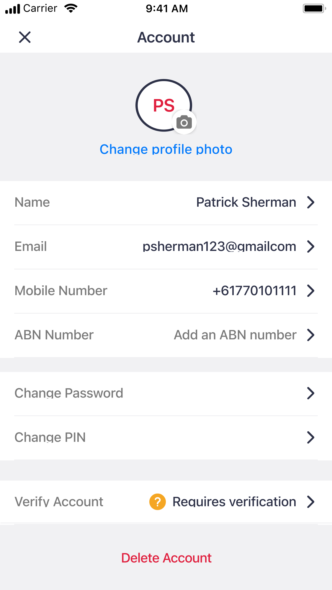
The old account was a single screen with your details, Change Password, Change PIN, Verify Account and a red Delete Account link, all at the same level. There was no place for Face ID, notifications, help or even logging out, and adding them would have made the page even longer.
Labels and values were on the same row, so long email addresses got squeezed. Verification, which decides what you can do in the app, was a row near the bottom. The design was also out of date, especially the notification settings.
Before
02 ProcessSplit the page into sections, so the account can keep growing.
01
Turn the account into a list of sections
The account now opens with a short list of sections: Personal information, Security & privacy, Notifications settings, Manage agents and Help. We grouped the settings by type, so most of the sections were pretty obvious.
Every setting is now one tap further away. But the list stays short even when new features are added, and Delete account is now inside Security & privacy instead of right under your phone number.
Before
Every setting at the same level, on one screen After
A short list of sections, with space for new ones 02
Show the verification status at the top
Verification decides what you can do in Sniip, so we moved it from the bottom of the page to right under your name, with an icon and a label for each state. Inside Security & privacy, the same row is red only when you need to do something.
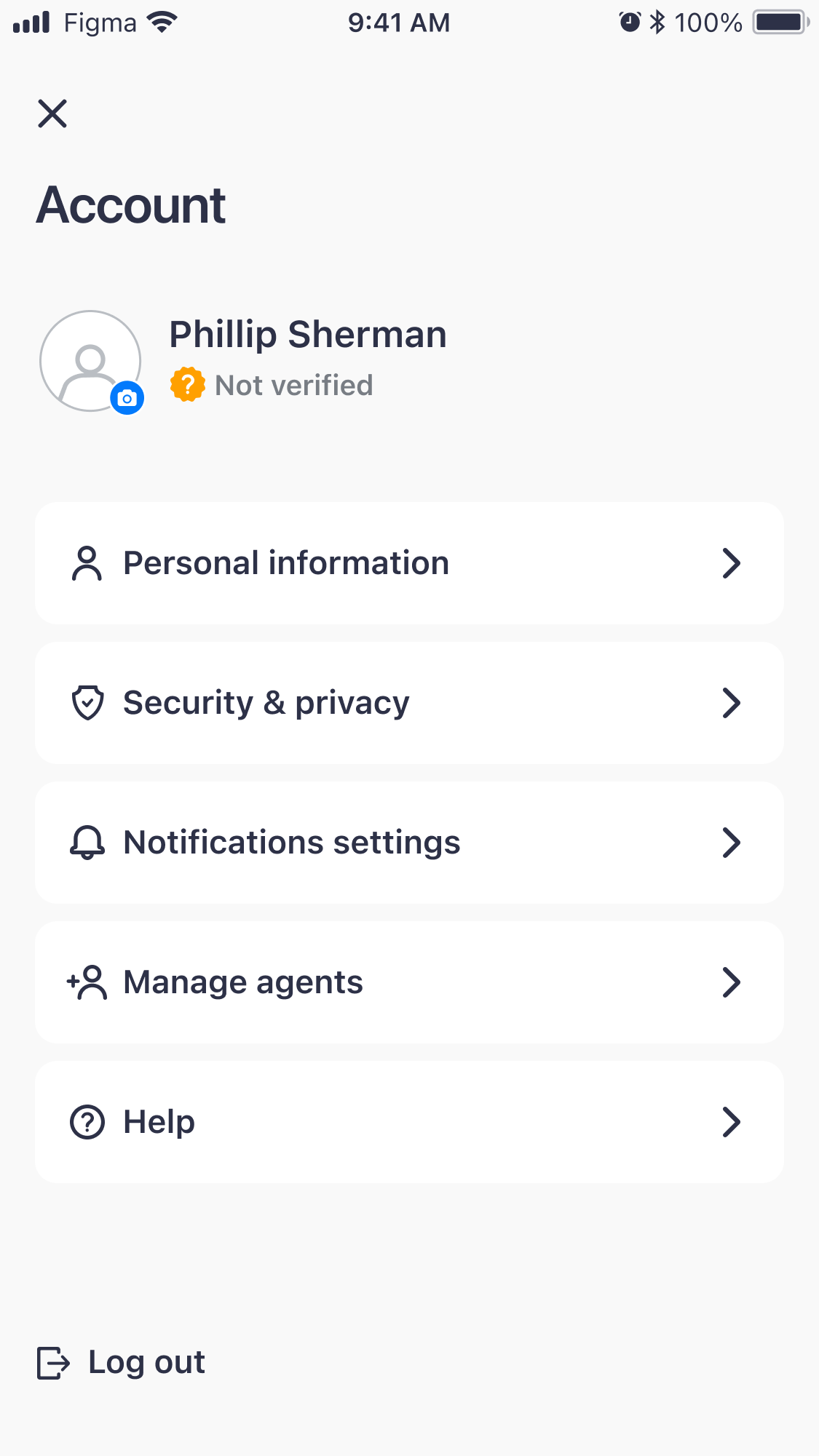
Not verified 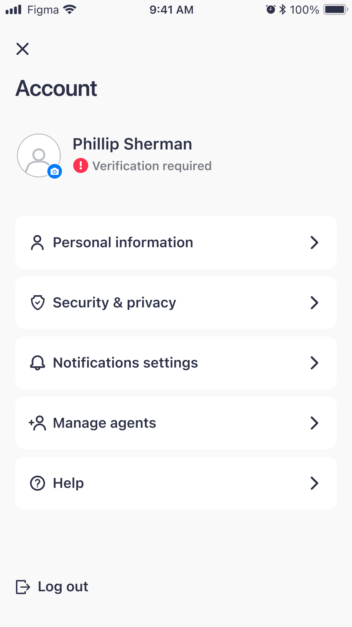
Verification required Verified 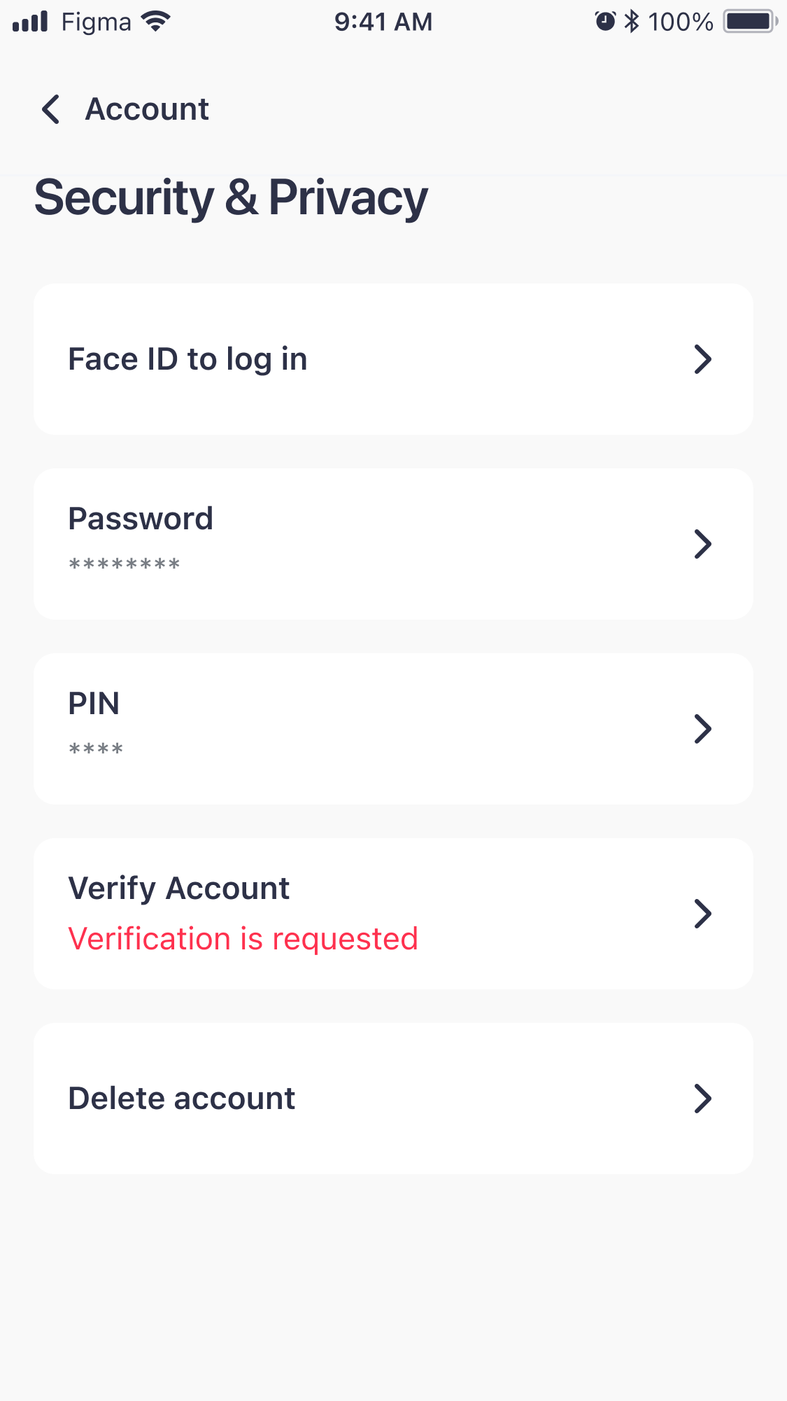
Inside Security & privacy, red only when you need to do something 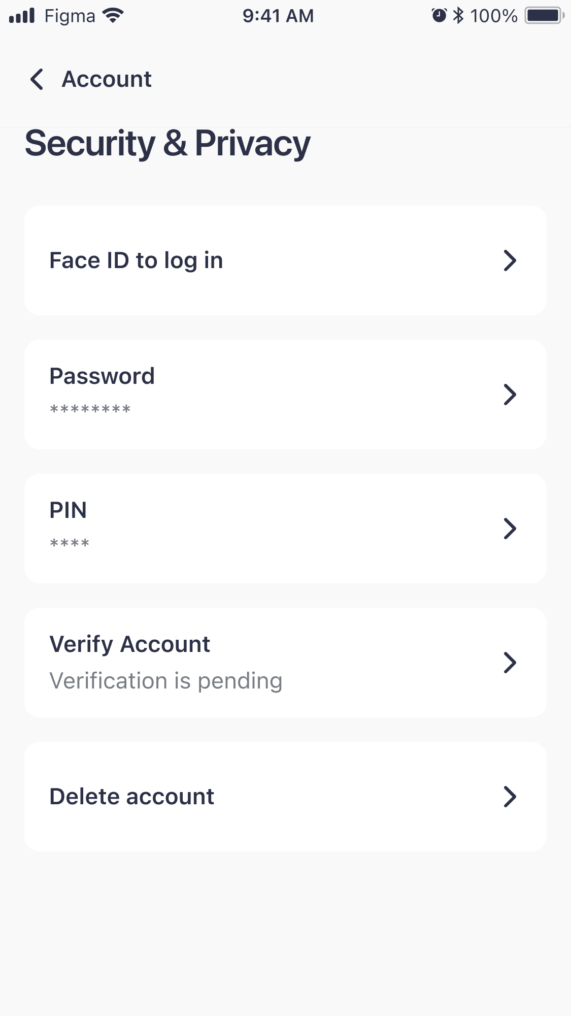
Pending: nothing for you to do, so no colour 03
Space for long values, and help for empty ones
Each section has one card per item, with the label on top and the value underneath, so long details fit. When a field is empty it tells you what to add, like "Add email", and optional fields are marked in the label. Every new section can reuse the same cards.
Label above value, so long details fit 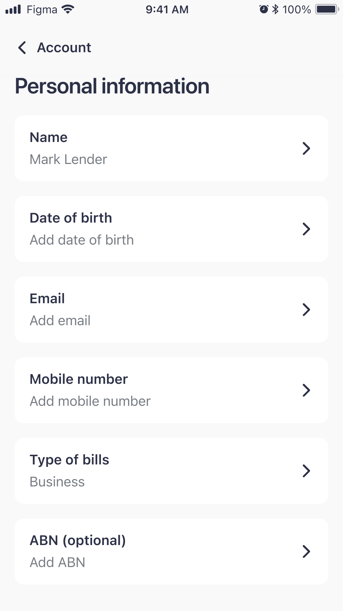
An empty field says what to add
03 SolutionOne page with your name, your verification status and a link to each section.
The account opens with your name, your verification status and the list of sections. Each section has its own purpose, so to add a new option we just add a row instead of redesigning the page.
04 Outcome
Now that notifications have their own section, people can manage them more easily, and customer support gets fewer requests about them. At first part of the team wasn’t sure about having more sections, but they changed their mind once they saw that.
Looking back
Some fields lock once you are verified, but the page never says why, so a locked field can look broken. I would mark those fields as verified and say that this is why they can’t change.
With another designer, the product lead and three developers at Sniip